Branding and Identity
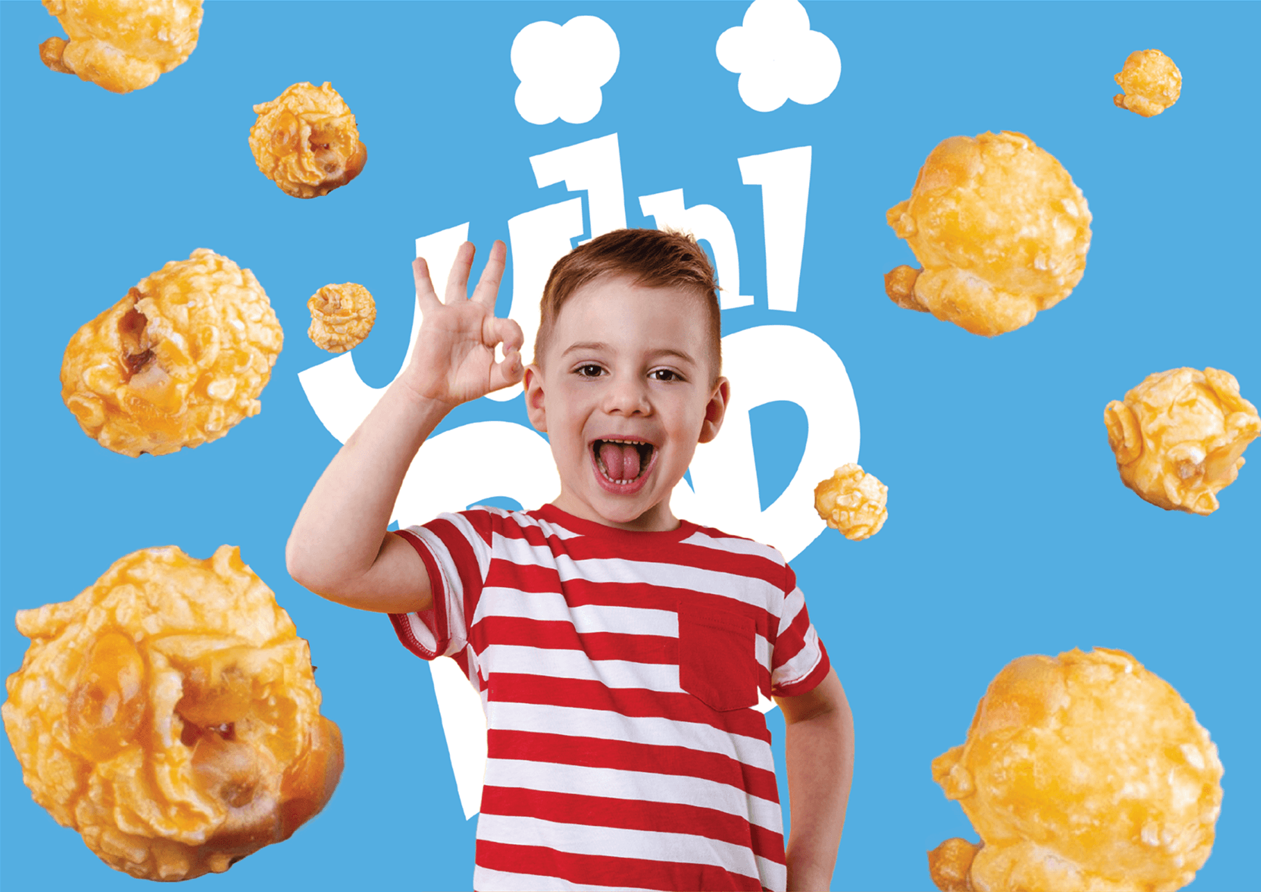
Bright colors. Soft forms. A popcorn with personality.
Project Mini Pop
Overview
A popcorn brand needed to feel fun, friendly, and impossible to ignore on the shelf. The goal? Build a visual identity that kids love and parents trust, something that pops (sorry, had to).
Brand Direction
Cheerful, energetic, light-hearted
Fun visuals that create instant connection
Bold colors, simple forms
Built to stand out, on shelves and screens

Process
Started with the basics: Who's buying this? Who's eating it? What does "fun" actually look like for a snack brand?
From there, moodboards, color exploration, type tests, and a lot of character sketches. The vibe came together fast once the personality clicked.
Solution
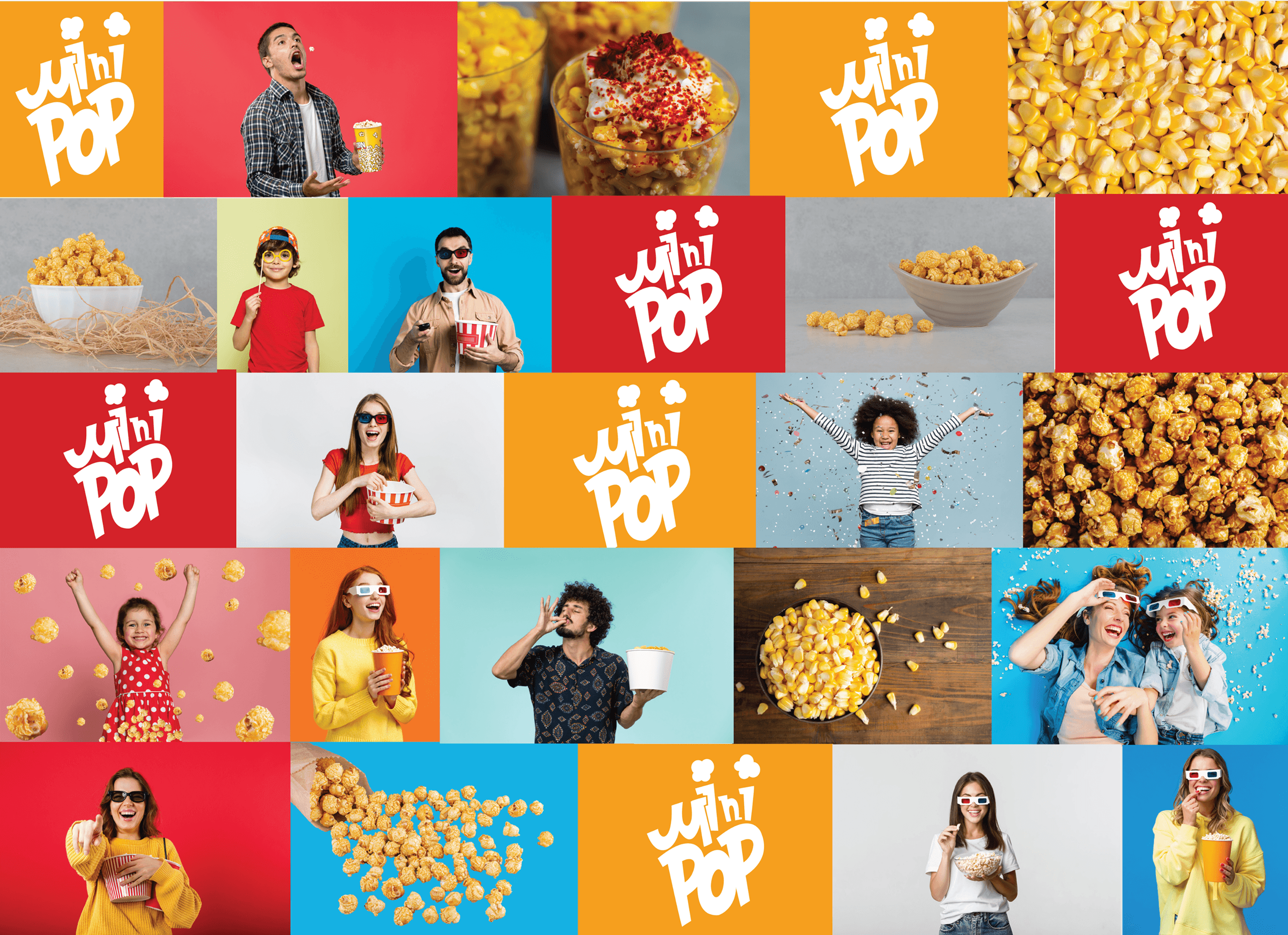
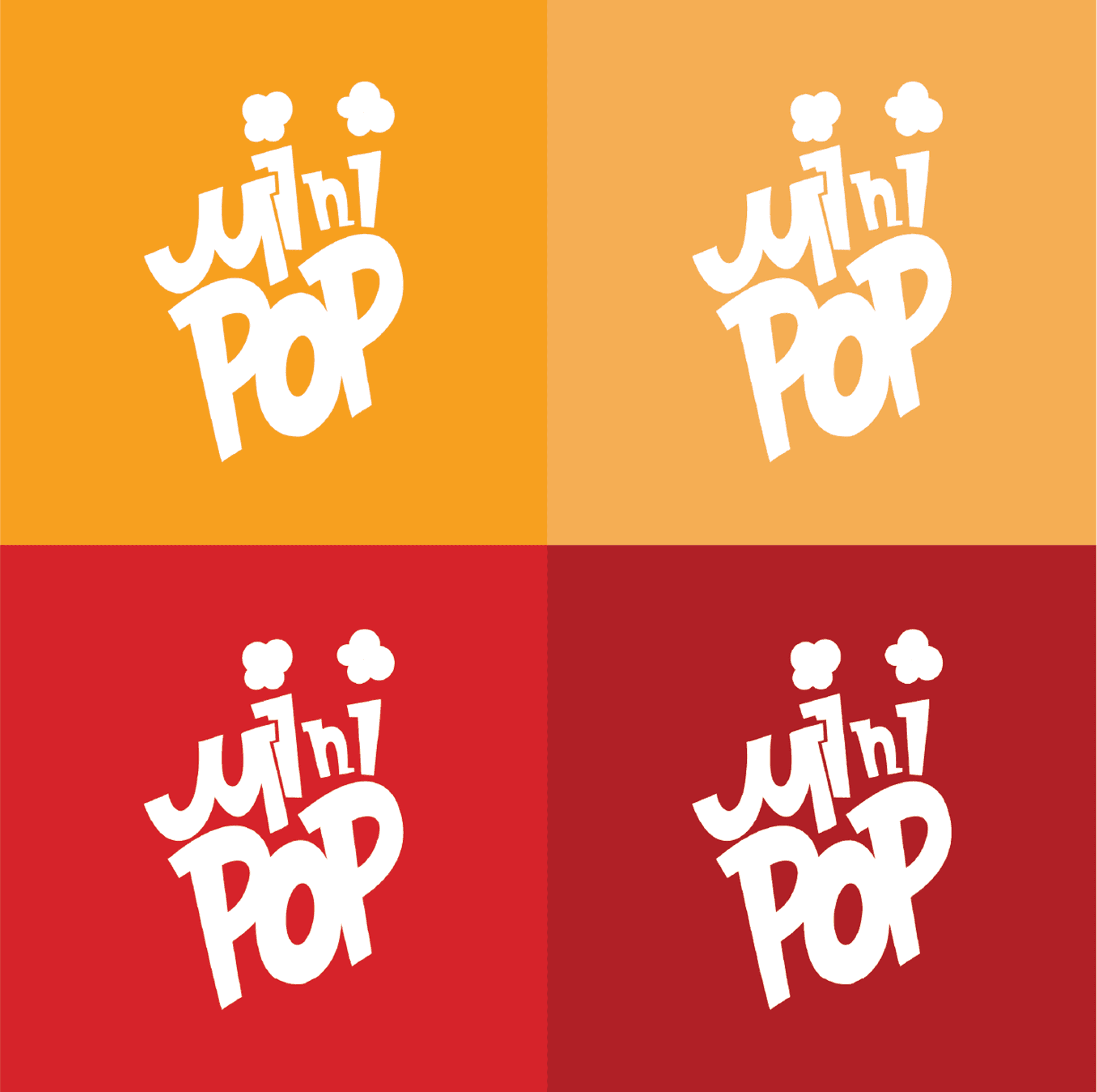
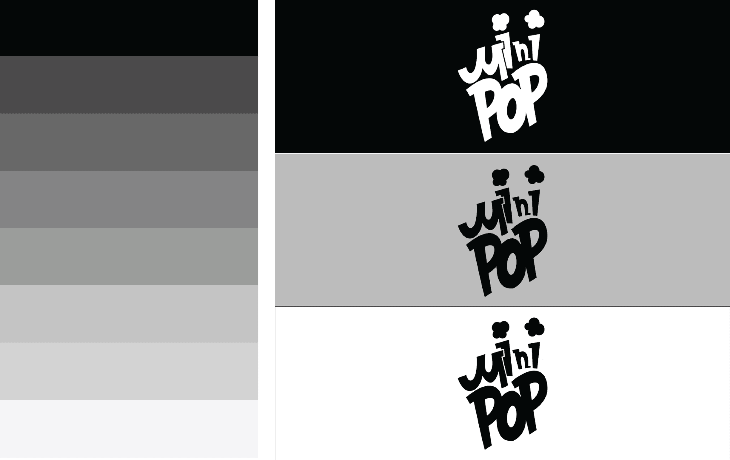
A full brand identity system: logo, colors, typography, illustrations, and packaging. The visual language is bold but soft, bright enough to grab attention, friendly enough to feel approachable.
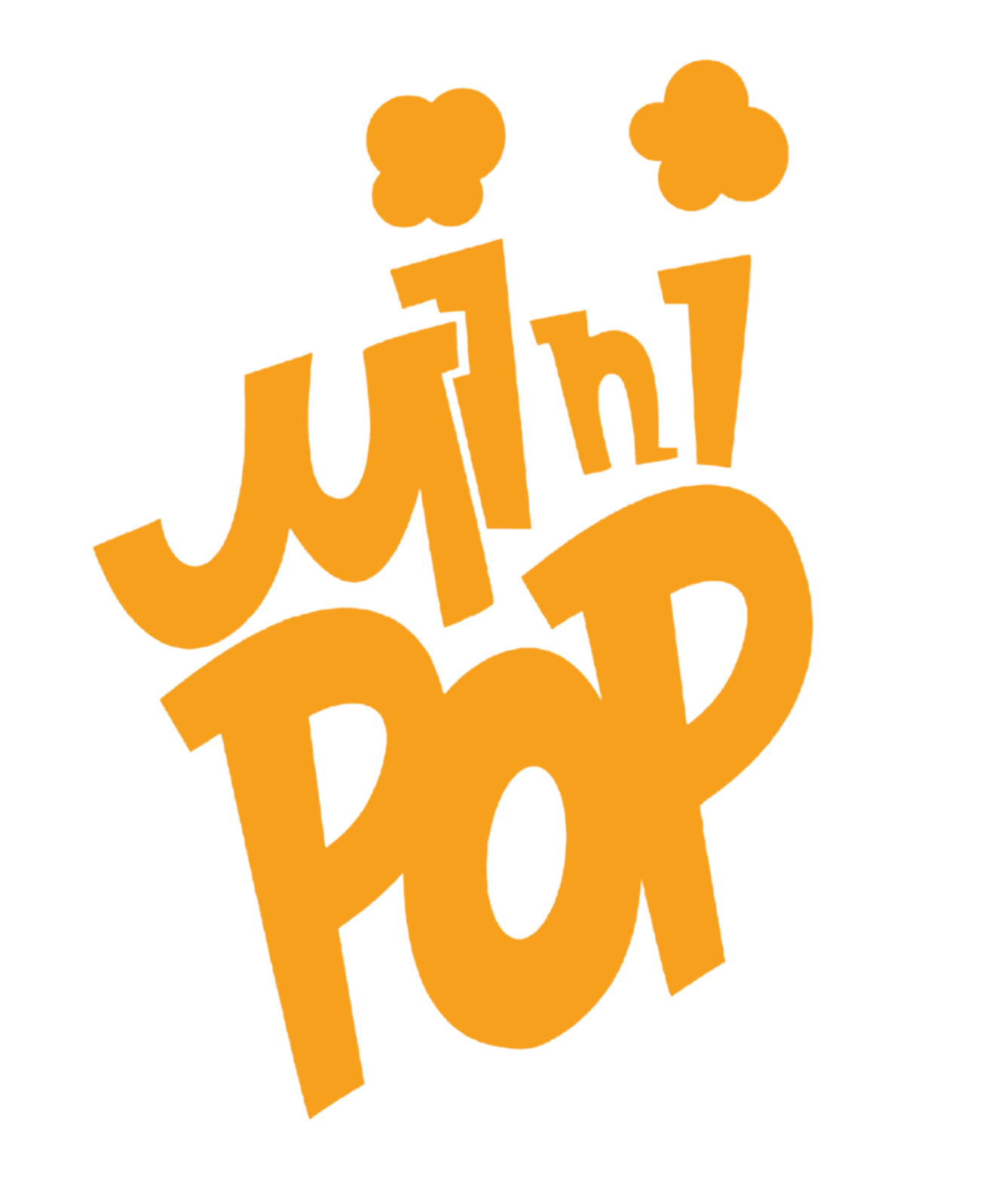
Logo Design
Character Design
Meet the popcorn crew. Expressive, a little goofy, and designed to work across packaging, social, and merch. They're the heart of the brand.

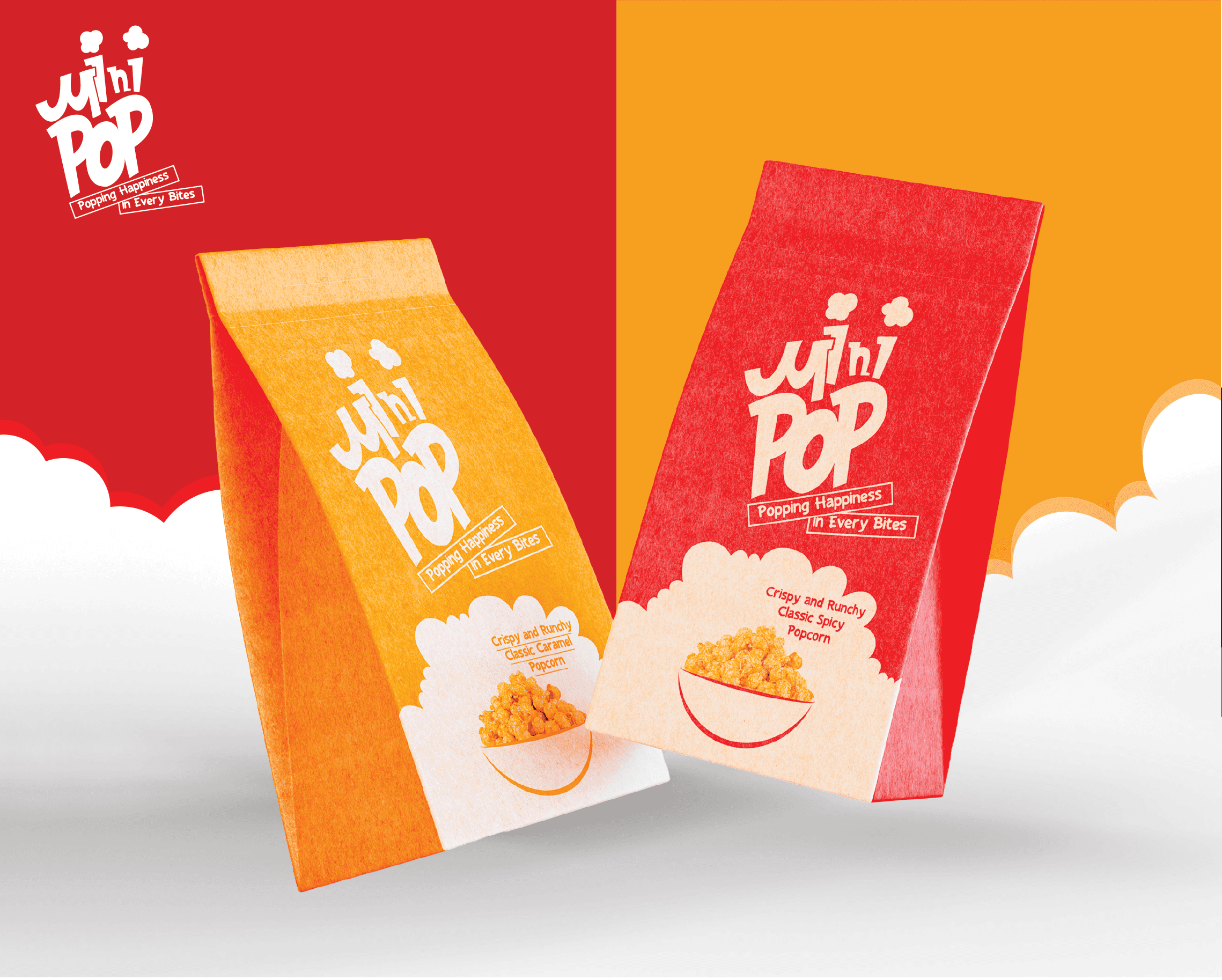
Package Design
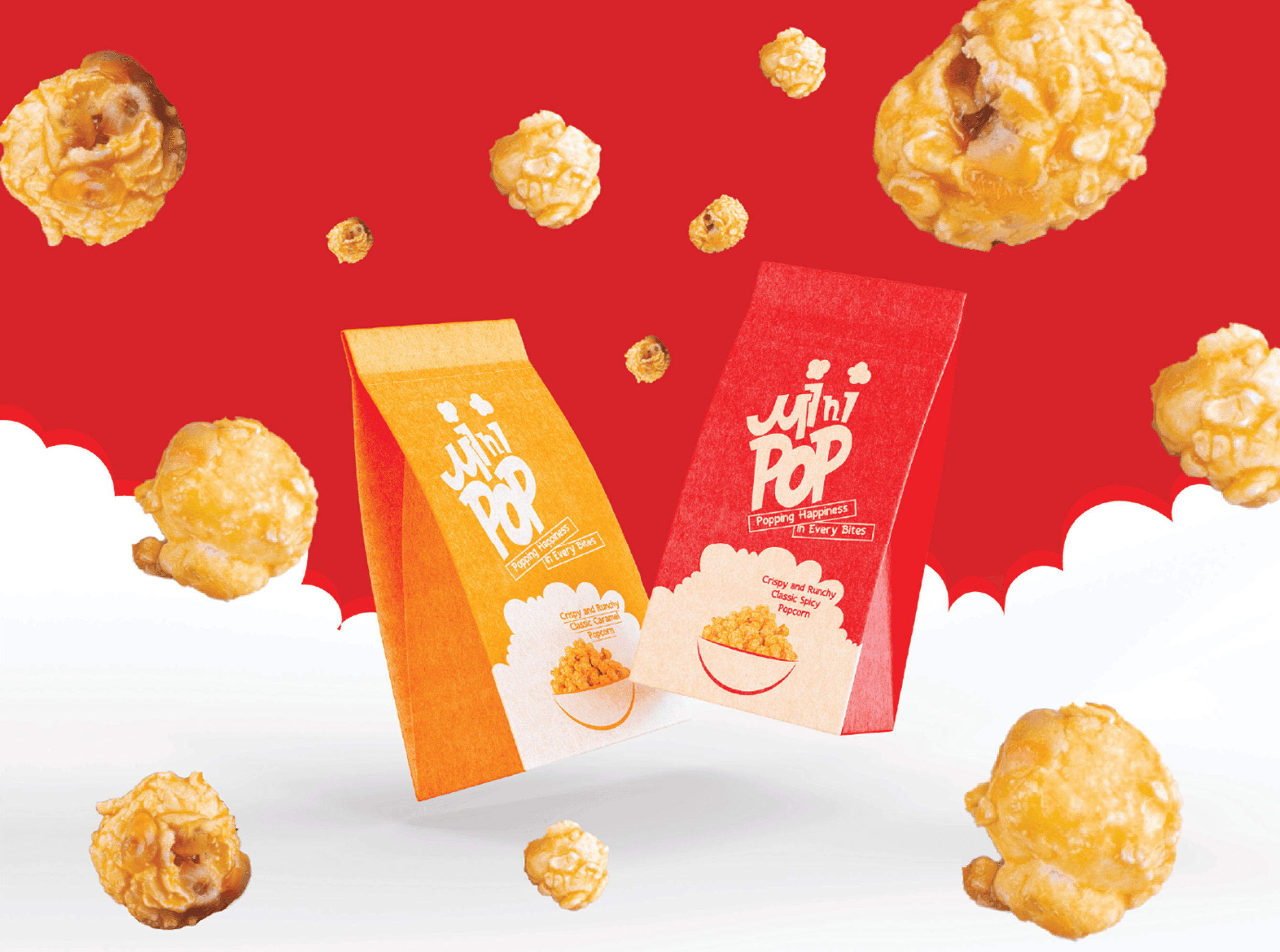
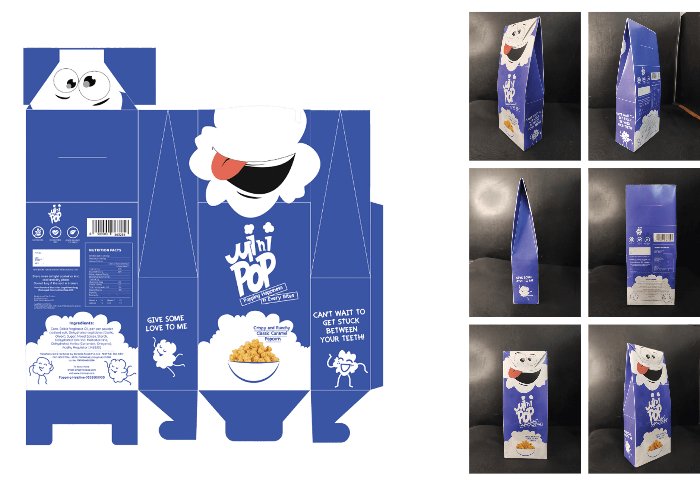
Eco-friendly, playful, built to stand out. The box shape itself is part of the branding, not just a container, but a character.
Mockup Design
The real test: does it look good in context? These mockups show how the brand holds up in the wild.